Modernizing an Industrial Brand Built on Precision
A brand and digital refresh for Morgan Mill Metals, a full-service precious metals refinery serving industrial, jewelry, and medical clients.
ROLE
Brand Designer, UX/UI Designer
SCOPE
Brand Identity Refresh, Website Redesign, Content Strategy
INDUSTRY
Precious Metals Refining
SUMMARY
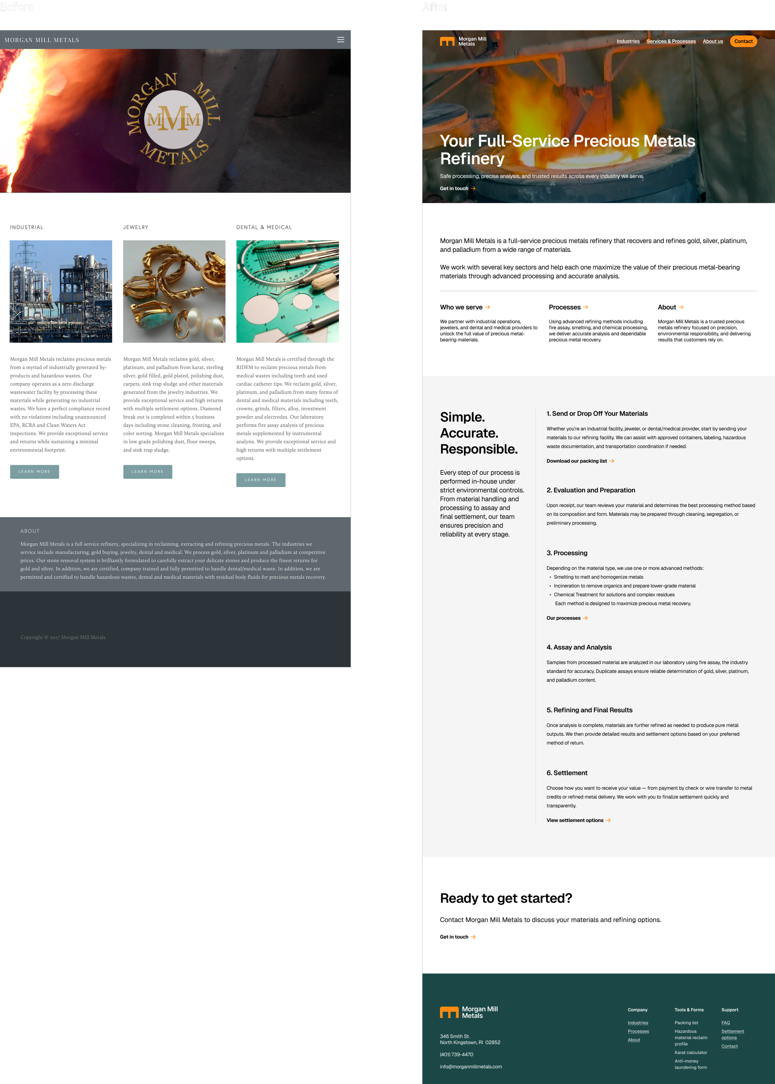
Morgan Mill Metals is a full-service precious metals refinery serving industrial, jewelry, and medical clients. While the company operates with a high level of technical expertise and environmental responsibility, its existing brand and website did not clearly guide customers through the services, processes, or next steps.
The goal of this project was to modernize the Morgan Mill Metals brand and improve the customer journey by creating a clearer path through the site. The redesign focused on guiding users to relevant services, explaining complex processes simply, and helping customers understand next steps with confidence.
Discovery
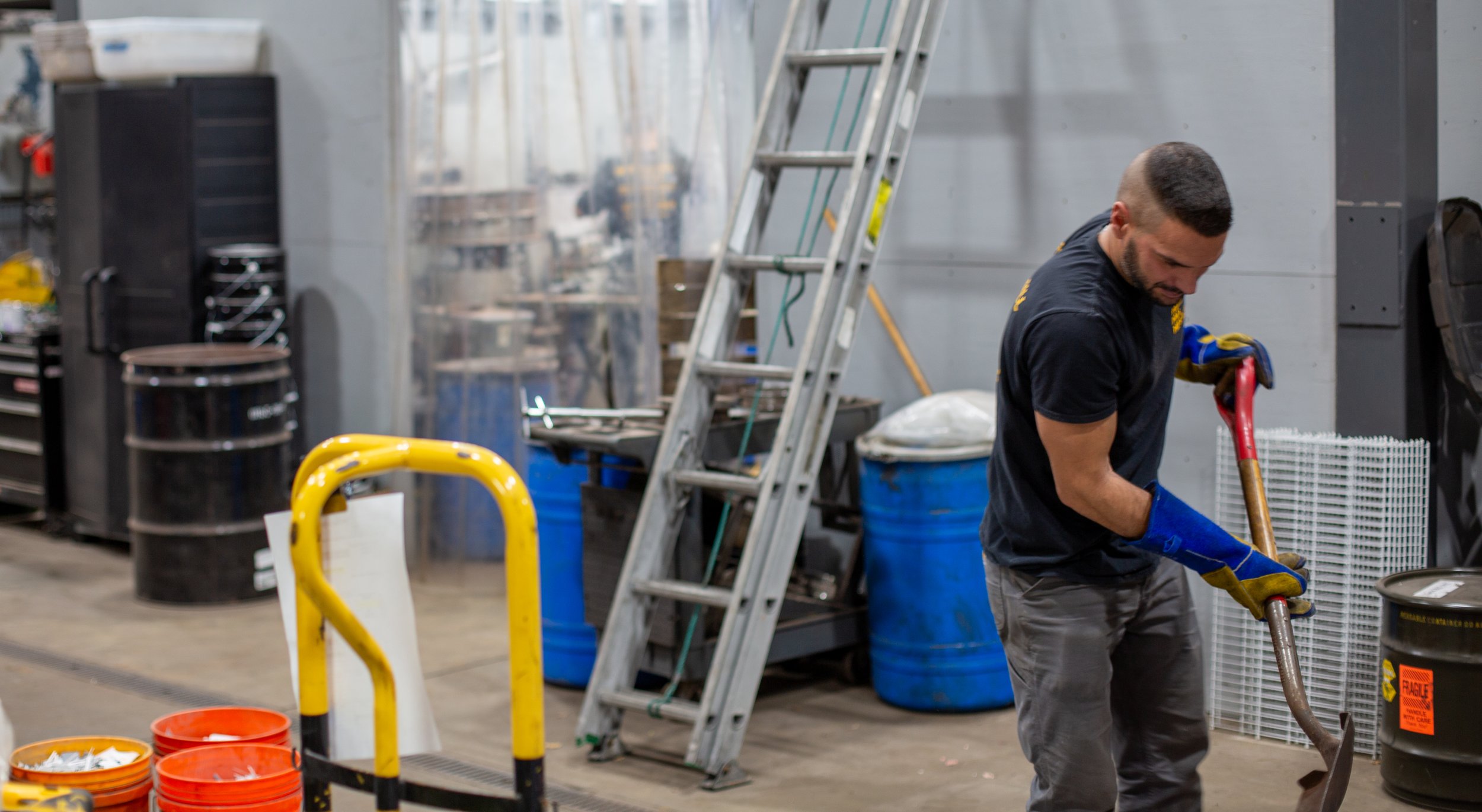
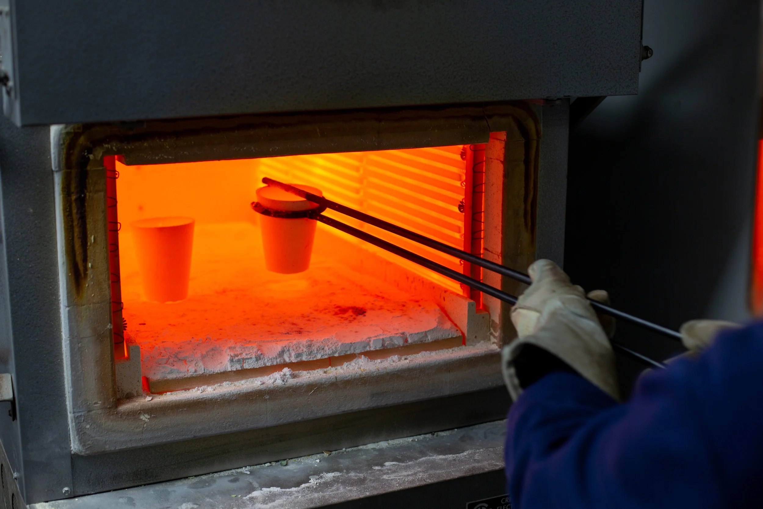
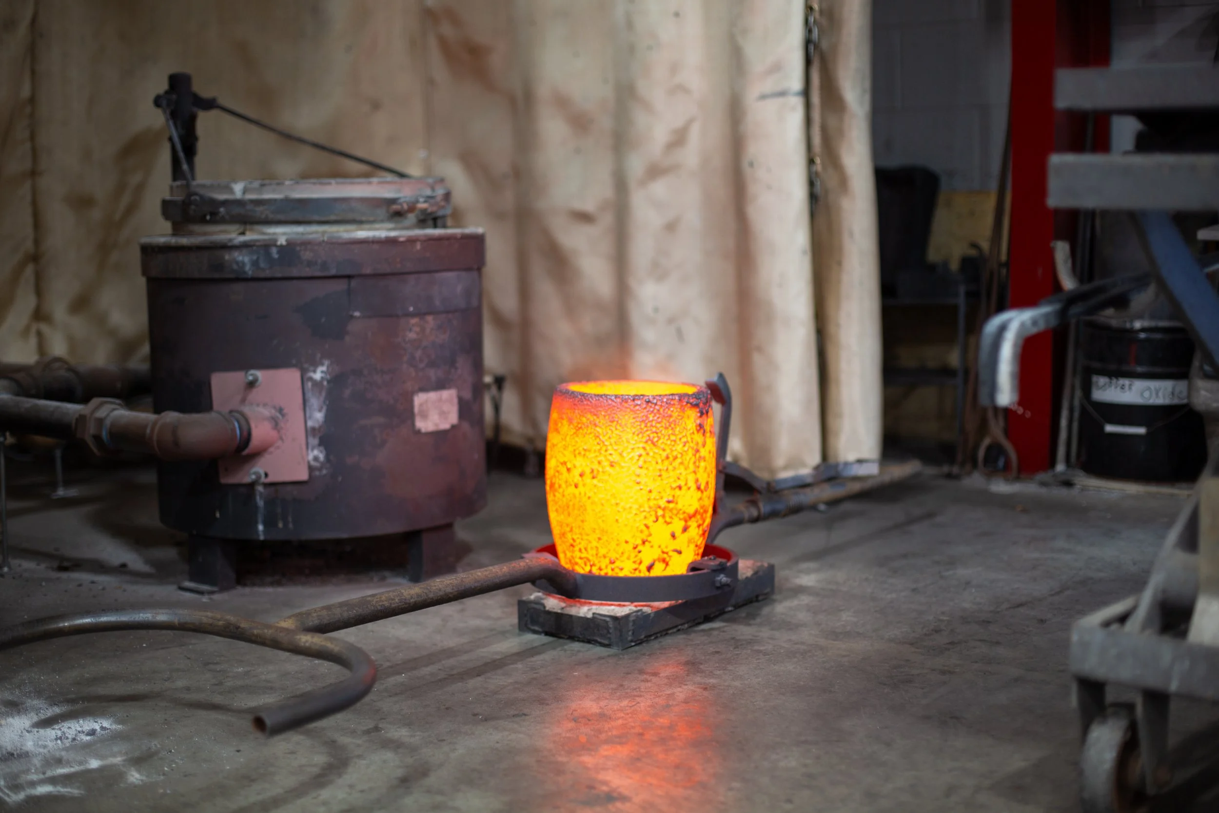
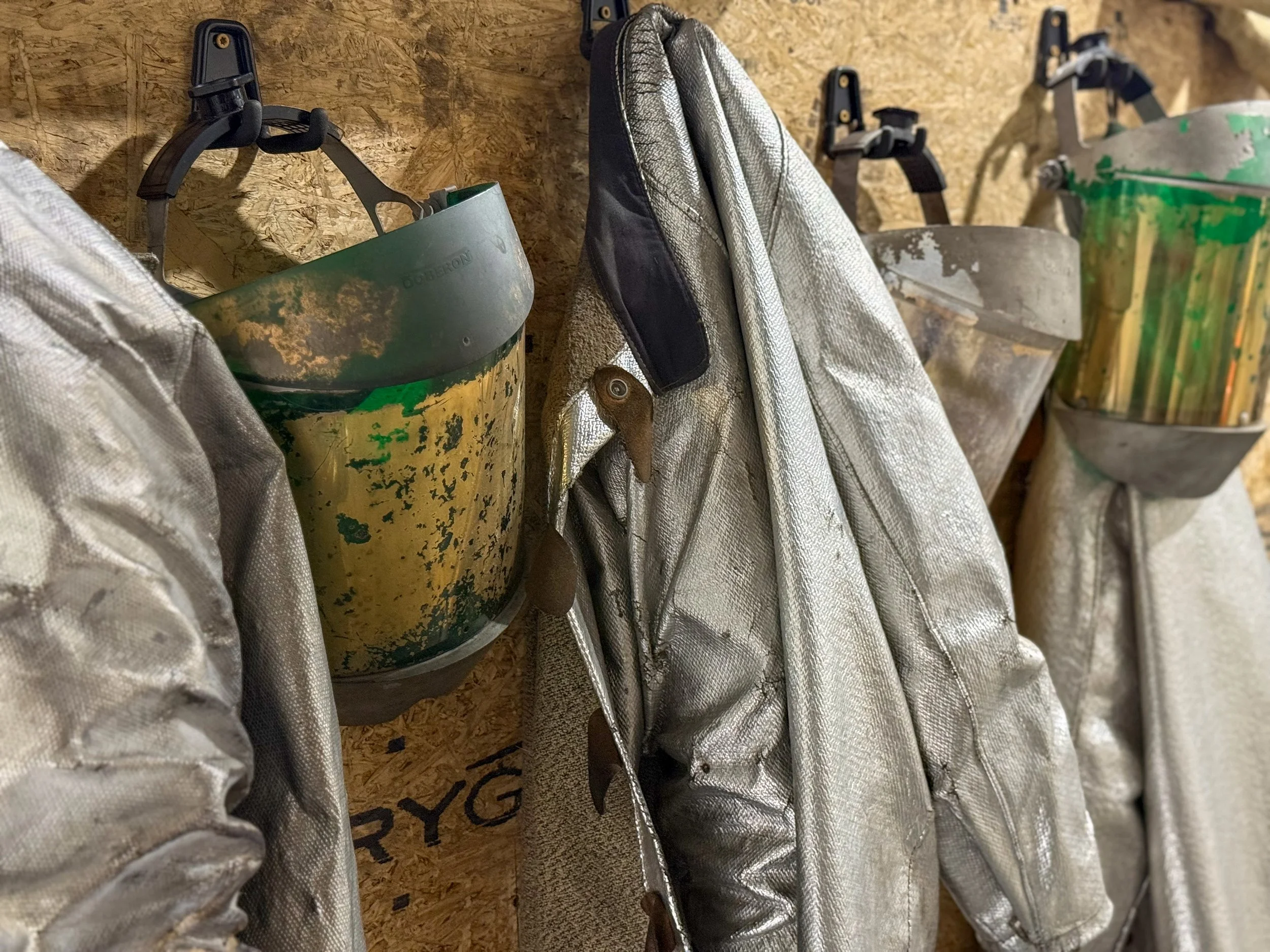
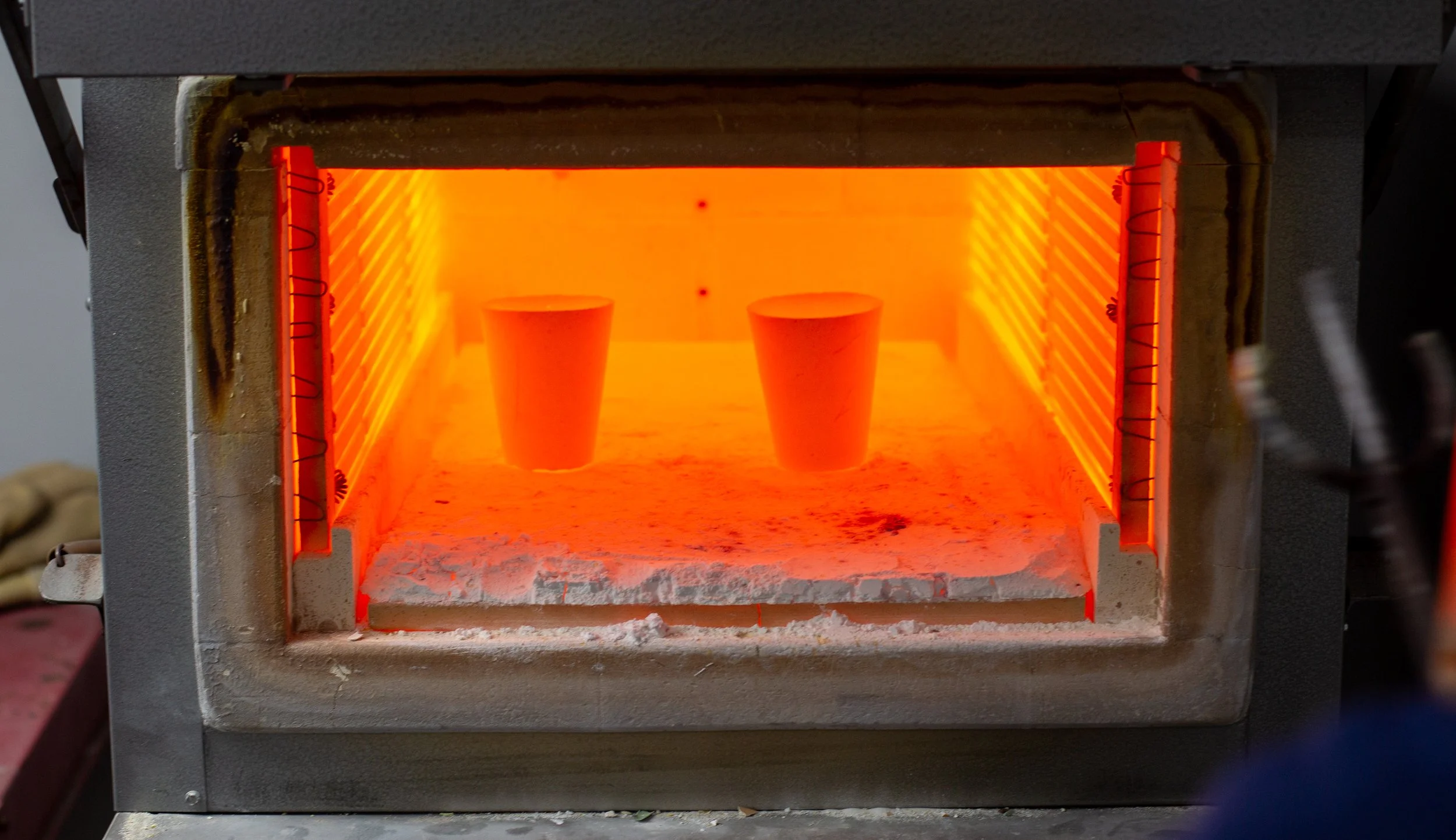
I began the project with a visit to the Morgan Mill Metals facility to see the refining process in action. Observing operations firsthand and hearing directly from the owner helped clarify what makes the business unique and where the customer experience needed to be strengthened.
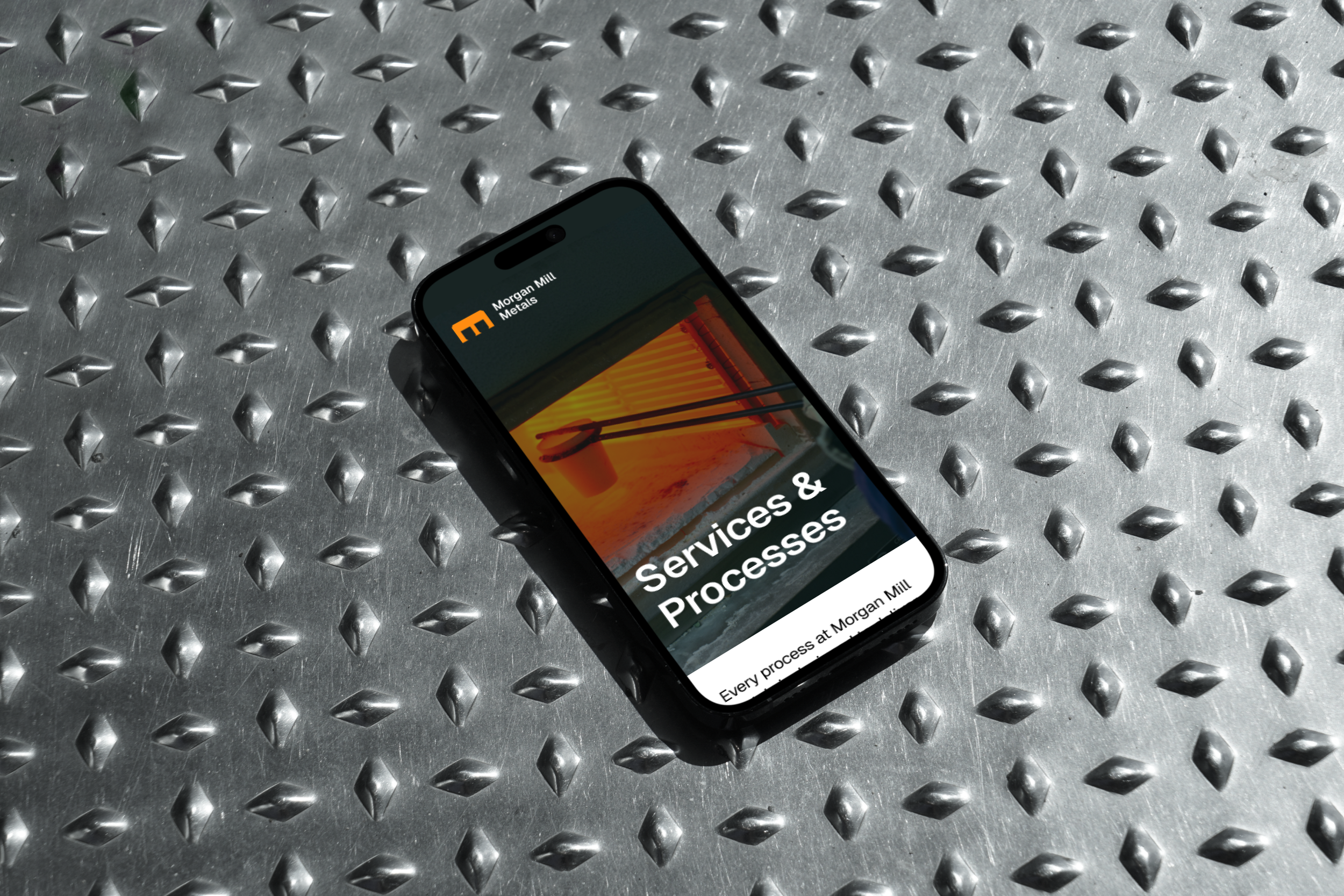
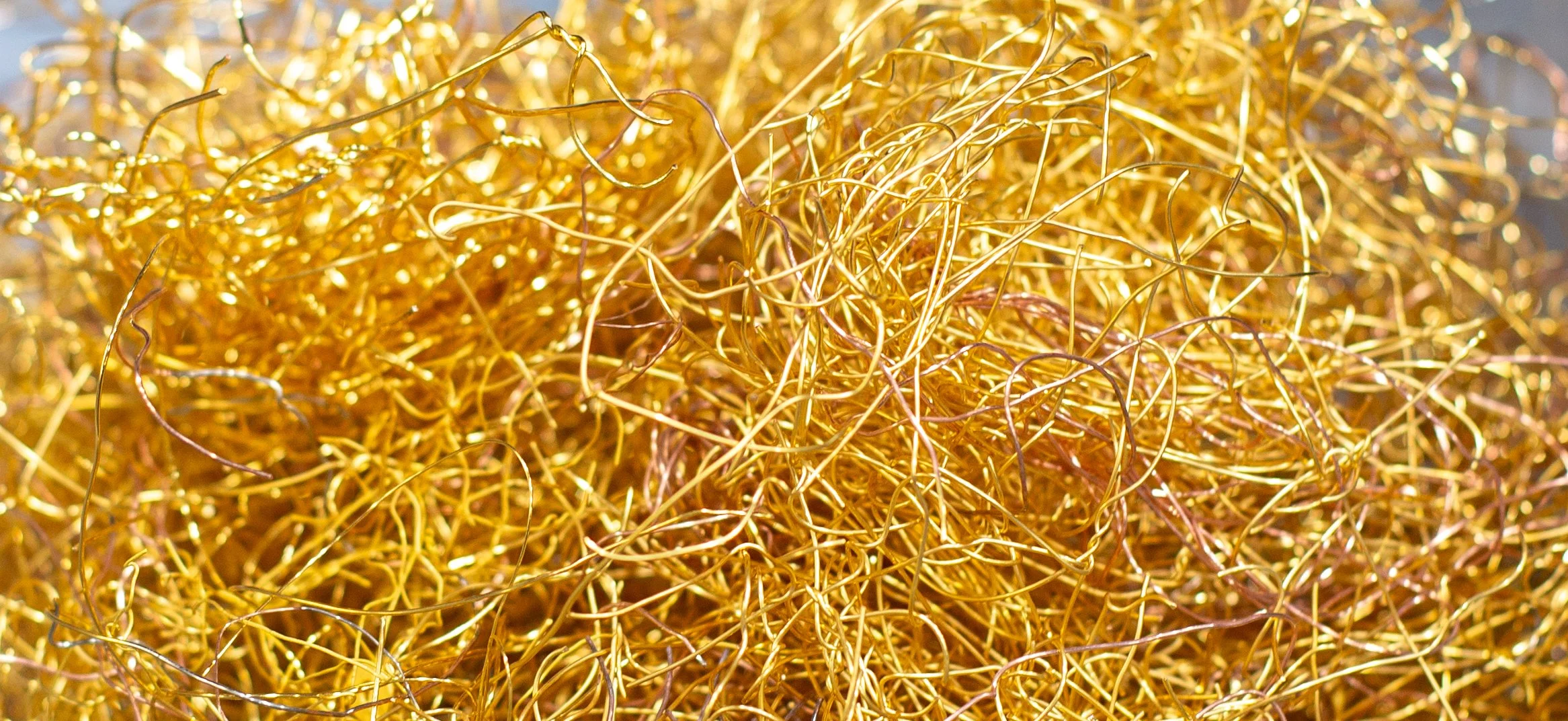
I also captured original photographs of the facility to inform the visual language of the brand, favoring real materials and environments over generic industrial stock imagery.
Logo
Inspired by the fire assay process, the mark is formed by two cupels positioned within a furnace to create a stylized “M.” This approach ties the identity to a foundational refining method while remaining abstract enough to feel modern and durable.
The logo was intentionally kept minimal, with a strong silhouette that scales easily across digital and physical applications. Its simplicity allows it to live comfortably on equipment, containers, and documentation without feeling decorative or forced.
Color
The color palette was reduced to two core colors drawn directly from the refining process.
Furnace, a vivid orange, represents heat, energy, and transformation. It is used as the primary brand color, bringing focus and intensity to key moments across the identity.
Verdigris, a deep green, provides contrast and balance. Referencing the natural patina formed on metal over time, it adds a sense of stability, longevity, and restraint.
Together, the palette reflects the balance between heat and control that defines the refining process, while remaining flexible across digital and physical applications.
Primary Color
Furnace
#FF6C11
Secondary Color
Verdigris
#1B4846
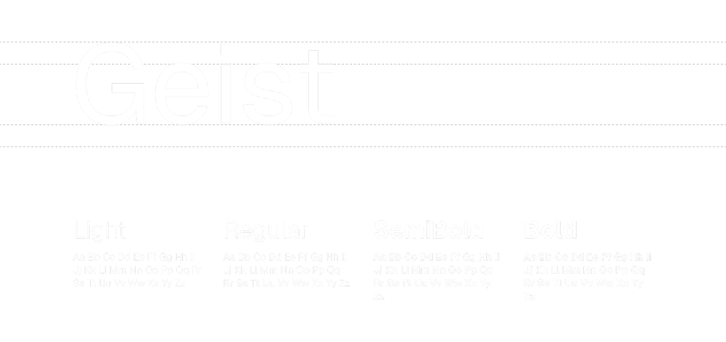
Typography
Geist was chosen as the primary typeface for its clarity and neutrality. Its clean, modern forms support both technical content and brand communication without drawing attention away from the message.
Designed for digital performance, Geist scales well across headings, body copy, and interface elements, making it well suited for a content-heavy, process-driven site. The type system emphasizes legibility and structure, reinforcing the brand’s focus on precision and reliability.
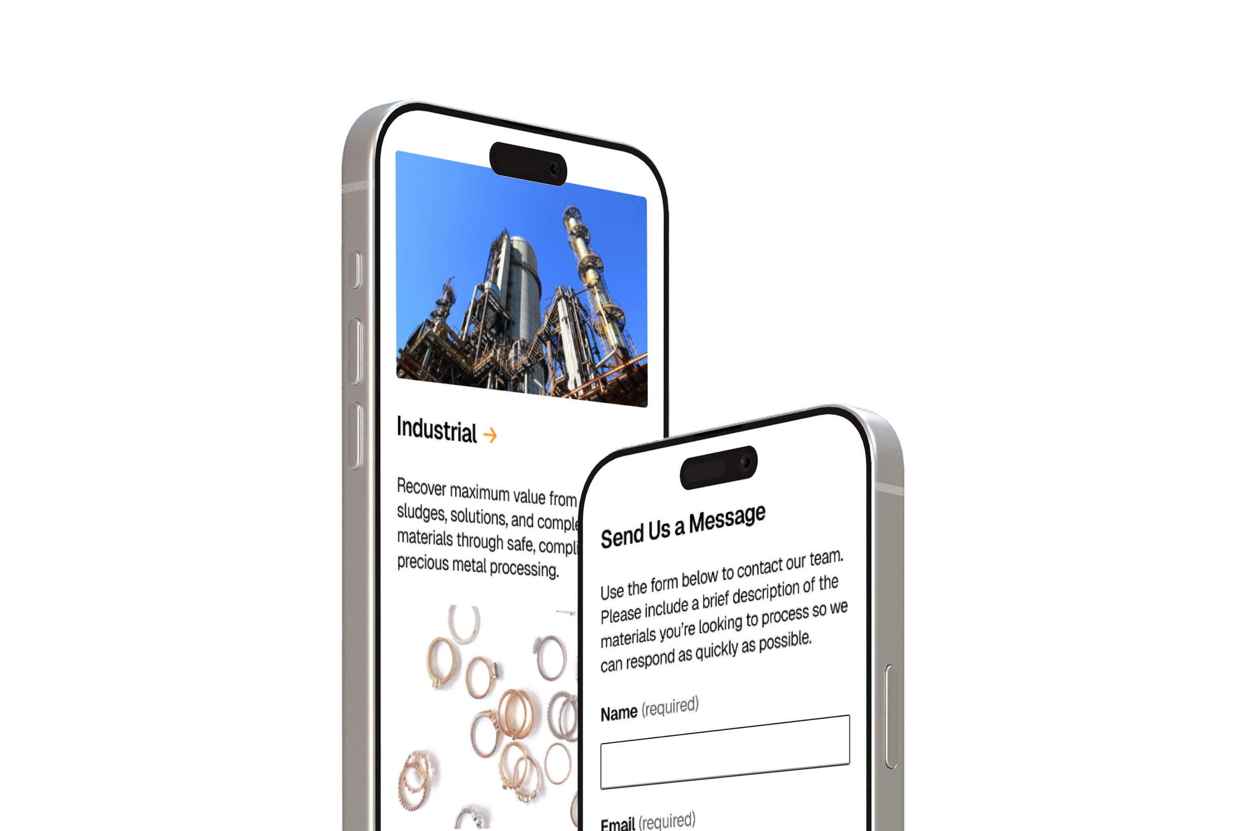
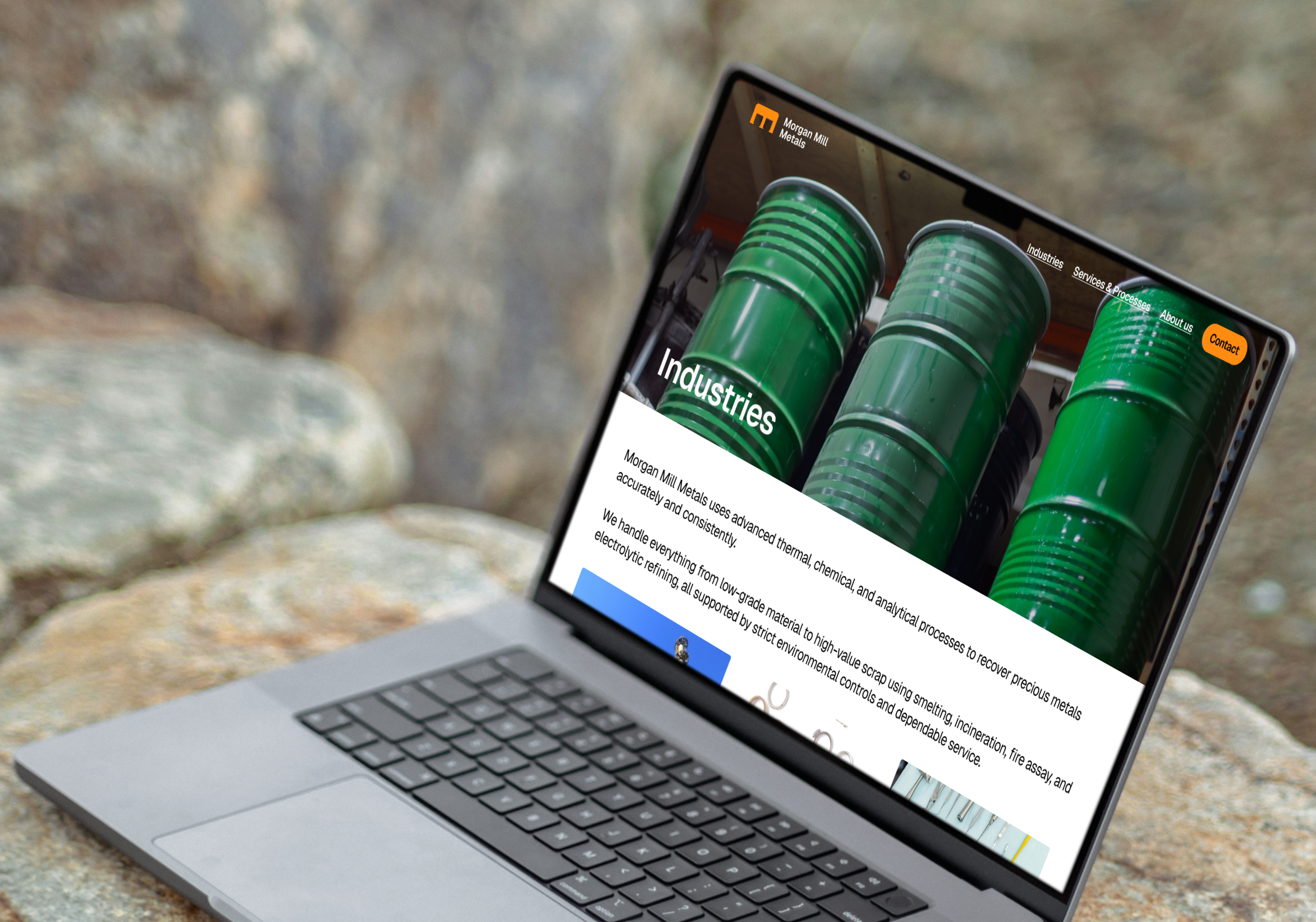
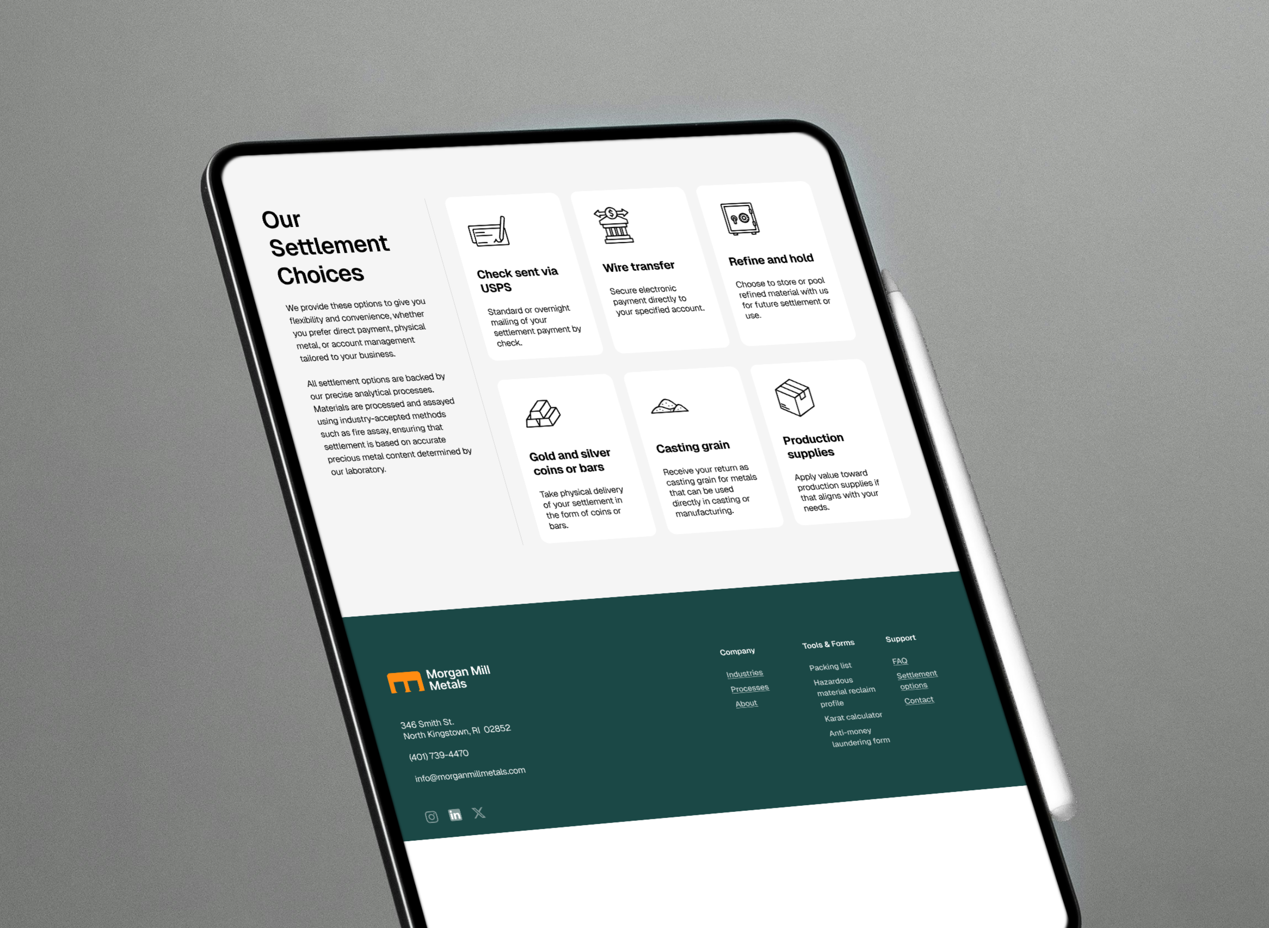
Website design
The website needed to do more than present information. It needed to guide customers through a complex industry with clarity and confidence.
The existing site contained valuable details, but the experience required users to piece together the story on their own. Services, processes, and next steps were difficult to understand without prior knowledge of the refining process.
The redesign focused on creating a clearer customer journey. Content was reorganized to lead users toward the pages most relevant to them, explain how the process works in plain language, and surface trust signals throughout the experience.
Navigation and page structure were simplified to reduce friction, helping users quickly understand what Morgan Mill Metals does, who it serves, and how to get started.